
Urgonic Codes
Hello!~ welcome to my coding resources carrd! ☆I'm revamping the previous carrd, which is why it looks different.
Almost all codes need CARRD PRO to work correctly, but I will include tips and tutorials to general website design too (doesn't need pro).Feel free to link me on your resource pages and check out my Neocities as well! I put a lot of work into it.Working on fixing the z-index on the dropdown, for now, click the home button to go back and choose categories.

carrd tips & tricks !
✮ you do not need carrd pro, especially pro plus, to make a good carrd that is pleasing to the eyes.
✮ tip: you can use color codes in order to have different colored letters.
✮ remember carrds are suppossed to be accessible and mobile friendly, and if your carrd is not mobile friendly please make a version of it that is ^_^ if you're on desktop go to the mobile editor and make all column containers "default" in stacking.
✮ highlights are your best friend for regular text.
✮ !! this is important... a lot of code does not make a good carrd !! you have to know basics of layout and web design.
google and research are your best friends. at the end of the day we're all learning and copying each other. code is not "owned" however it is common courtesy to ask before taking something someone coded from scratch and please do not copy people's personal layouts without permission. there's a lot of generic templates out there. also please don't ask credit for code/a layout that isn't fully thought of and made by you.a lot of people don't use them but headers and footers are very useful in certain kinds of "open scroll" carrds.


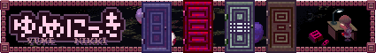
other carrds
random pixels and graphic resources I have found, none made by me! ☆ (๑′ᴗ‵๑)I Lᵒᵛᵉᵧₒᵤ♥
wip. lmk if you wanna be added
tumblrs
purinpixel + maggotlover99 + momsagainstinternetuse
laimina + my uploads + atebit + stringworms
webshittt + blinksanity + lemonarchives
random recs
my neocities + emojibank + my neocities stamp collectiongraphics
88x31 buttons + glowtxt + animated text gifs + gifcities
graphics website + more text + glitter graphics
cameron's world dl + sozai web graphics + stripe generator
smilies + line stickers for free tut + custom cursors
cute graphics + more smilies and kao
kaomoji + unicode search + musesrealm + archived gifs + dividers + more gifs + pkmn trainer card graphicblinkies
more blinkies + blinkie collection + even morecoding
w3schools + devhints + windows xp css ui + dafont
google fonts + wordart maker + pixel fonts + pixel fonts 2other
image upscaler + webamp + non carrd bookmarks


random pixels and graphic resources I have found, none made by me! ☆ (๑′ᴗ‵๑)I Lᵒᵛᵉᵧₒᵤ♥
dividers + small pixels + big pixels + backgrounds + pngs

swirls / spirals


nukos


kaomoji


smileys


nature


creepy / blood / horror


animals


sanrio & related


media / anime / etc


goth / dark


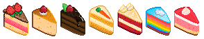
food


medical


angels


tech


toro inoue
misc

edgy / violent / etc


nature


cute


colorful


lace


misc


My name's Marshal, but I also go by Urgonic as my social media name. I'm a 20 year old man, an animation student and I do website building & coding as a hobby. Trying to pick up programming too.I hope you have a good day!


here are some codes! credit needed when asked for by other creators. ☆ (๑′ᴗ‵๑)I Lᵒᵛᵉᵧₒᵤ♥
🍃 = FAV
text + borders + images + links + javascript
scrollbox + menus & bg + cursors + misc


text codes . . . !
codes made for text ranging from animations to simple text effects and tutorials. ☆ (๑′ᴗ‵๑)I Lᵒᵛᵉᵧₒᵤ♥
🍃 = FAV
pop text (also for imgs) 🍃 + text stroke
glitch text (mine) + marquee text + offset text
cool effects 🍃 + gradient text + gifs besides text
gif as text bg + hover effects website
randomized quotes 🍃 + vertical text + curved text


border codes . . . !
codes made for borders of images and divs.☆ (๑′ᴗ‵๑)I Lᵒᵛᵉᵧₒᵤ♥
🍃 = FAV
double borders + wacky border 🍃 + lace/img borders
inset borders + scrollbox bow border + blurred borders + black lace 🍃


img&div codes . . . !
codes made mainly to use with images, or divs (not border related) ☆ (๑′ᴗ‵๑)I Lᵒᵛᵉᵧₒᵤ♥
🍃 = FAV
shaking images + heart mask
blur and zoom 🍃+ paper mask from gnome + custom div over container + fixed footer + 2 img slideshow circular gradient border + star mask
little swinging img + twitching img
floating image 🍃 + fog mask for pro plus
+ shadow filter for text&imgs + container&img pop


link codes . . . !
codes made mainly to use with links ☆ (๑′ᴗ‵๑)I Lᵒᵛᵉᵧₒᵤ♥
🍃 = FAV
wipe links 🍃+ hover spacing + rainbow links🍃
blue&italics hover + gradient underline
sliding underline + shadowed link
squiggly underline (different from the one on my website)
ticker link


jscript codes . . . !
codes that heavily depend on javascript ☆ (๑′ᴗ‵๑)I Lᵒᵛᵉᵧₒᵤ♥
🍃 = FAV
draggable box 🍃 + peeping graphic 🍃+ typing tab
cool javascript effects 🍃 + blobs in a jar effect 🍃
general draggable elements


scrollbox codes . . . !
codes that relate to the scrollbox ☆ (๑′ᴗ‵๑)I Lᵒᵛᵉᵧₒᵤ♥
🍃 = FAV
old web scrollbar + hidden scrollbar
skewed scrollbox


bg & menu codes . . . !
codes, mostly relating to the layout of the page and more complex. credits linked ☆ (๑′ᴗ‵๑)I Lᵒᵛᵉᵧₒᵤ♥
🍃 = FAV
scanlines + different bg on section + tabs +
simple drop menu
mobile dropdown, cr 805online 🍃 + slide up menu
slide menu 2 + scrolling menu + fog bg img + book flipmy own menus coming soon!


cursor codes . . . !
codes that relate to the mouse cursor ☆ (๑′ᴗ‵๑)I Lᵒᵛᵉᵧₒᵤ♥
🍃 = FAV
custom cursors 🍃 + fake custom cursor + image trail
heart clicksplosion


misc codes . . . !
codes that do not fit anywhere else ☆ (๑′ᴗ‵๑)I Lᵒᵛᵉᵧₒᵤ♥
🍃 = FAV
music players 🍃 + basic custom scrollbar
custom gif scrollbar + absolute positioning
flip card 🍃 + transparent bg selection
imported custom fonts 🍃+ vertical img marquee gifypet + cute counters + embedded chatbox
windows bar + disable right click + universal rubber band code + loading animations🍃 + wavy filter + shaky filter 🍃 + elements appear on hover + tooltips that follow cursor
peeping image + webneko


music players . . . !
one of them featured on my personal carrd
🍃 = FAV
cool player w skip + vinyl music player 🍃
music player 2 + glenthemes music players on tumblr + gradient player


to do custom cursors you can either do them for the entire carrd, on hover, or for specific sections of the carrd.for the entire page:
<style>
html, body {
cursor: url("cursor.png"), default;
}
</style>
on hover:
<style>
a:hover {
cursor:help; (or cursor url)
}
</style>
on section:
<style>
.wawa {
cursor: url("https://benzos.neocities.org/images/monoko%20cursor.gif"), default;
}
</style>


there's two ways to add stroke to text through css, and you can make it as complicated or as simple as you would like. here's a few codes to get you started:
text-shadow: -1px 0 black, 0 1px black, 1px 0 black, 0 -1px black, 0 0;+ or you can use:-webkit-text-stroke: 1px black;for a simple method!here's my favorite personal text shadow:
text-shadow: 2px 2px 0 #4074b5, 2px -2px 0 #4074b5, -2px 2px 0 #4074b5, -2px -2px 0 #4074b5, 2px 0px 0 #4074b5, 0px 2px 0 #4074b5, -2px 0px 0 #4074b5, 0px -2px 0 #4074b5;


to get a double border, just use the double border type already set in html.
.double {
border-top: 4px double #000000;
border-left: 4px double #000000;
border-right: 4px double #000000;
border-bottom: 4px double #000000;
}
you can also simply use border: 1px double #000;


marquee's are very simple and a staple of old-web themed carrds. here's how to add one:
<div id="woo"> <marquee behavior="scroll" direction="right"> text </marquee>
</div>
to edit how the marquee looks, edit a div marked which is marked as "woo" in this example in another HIDDEN IN HEAD embed.you can also inline embed edit marquees, using span styles- although this might make your code longer. here's a personal inline marquee:
<marquee scrollamount="10"><span style="background: -webkit-linear-gradient(#000 ,#8f8f8f);
-webkit-background-clip: text;
-webkit-text-fill-color: transparent; -webkit-text-stroke: 0.2px black; font-size: 1.5em;">this is text</span></marquee>


this version of offset text uses carrd pro plus, but you can do the same with embeds.to offset text, which is done on this carrd- there's multiple methods. I put this one personally in the css box that comes with carrd pro plus and adjust as necessary:
bottom: -0.5em;
z-index: 9999;
position: relative;


just make the text an inline embed that you edit either also inline or in another embed, and then you add <img src="picturehere.png">.
 hello this is an inline text with a gif attached to it

here's a few personal favorite text effects of mine. all of them can be found on MY PASTEBIN!
Blink
Hover Tilt
Tossing
Hover Spin
Twist
Infinite Spin
a basic text, div or image rotation involves typing in:
transform: rotate(10deg);


<style>
img:hover {
/* Start the shake animation and make the animation last for 0.5 seconds /
animation: shake 0.5s;
/ When the animation is finished, start again */
animation-iteration-count: infinite;
}
@keyframes shake {
0% { transform: translate(1px, 1px) rotate(0deg); }
10% { transform: translate(-1px, -2px) rotate(-1deg); }
20% { transform: translate(-3px, 0px) rotate(1deg); }
30% { transform: translate(3px, 2px) rotate(0deg); }
40% { transform: translate(1px, -1px) rotate(1deg); }
50% { transform: translate(-1px, 2px) rotate(-1deg); }
60% { transform: translate(-3px, 1px) rotate(0deg); }
70% { transform: translate(3px, 1px) rotate(-1deg); }
80% { transform: translate(-1px, -1px) rotate(1deg); }
90% { transform: translate(1px, 2px) rotate(0deg); }
100% { transform: translate(1px, -2px) rotate(-1deg); }
}
</style>
if you only want 1 image to shake make sure to give it a class, like this:.gay img:hoverTHIS IS NOT RECOMMENDED FOR ACCESSIBILITY!example:


you can use any image instead of the heart in order to mask it (for example: a star)if the image cuts off etc change the webkit mask size. you can also mask gifs.
<style>
.heart {
-webkit-mask-image: url(https://i.imgur.com/bIX4M8u.png);
-webkit-mask-size: 50%;
-webkit-mask-repeat: no-repeat;
-webkit-mask-position: center;
}
</style>


here's some effects you can apply to visual aspects of your design:
grow effect

.grow{
overflow: hidden;
}.grow img {
/* / -webkit-transition: all 2s ease;
-moz-transition: all 2s ease;
-o-transition: all 2s ease;
-ms-transition: all 2s ease;
transition: all 2s ease;filter: blur(0);
-webkit-filter: blur(0);
-moz-filter: blur(0);
-o-filter: blur(0);
-ms-filter: blur(0);
-ms-filter: blur(0px);/filter:progid:DXImageTransform.Microsoft.Blur(PixelRadius='0'); */}.grow img:hover {-moz-transform: scale(1.5);
-webkit-transform: scale(1.5);
-o-transform: scale(1.5);
transform: scale(1.5);
filter: blur(2px);
-webkit-filter: blur(2px);
-moz-filter: blur(2px);
-o-filter: blur(2px);
-ms-filter: blur(2px);filter:progid:DXImageTransform.Microsoft.Blur(PixelRadius='5');}
zoom effect
.zoom img {max-width: 100%;
transition: all 0.3s;
display: block;
width: 100%;
height: auto;
transform: scale(1);
}
.zoom:hover img {
transform: scale(1.1);
}
blur effect

.blur img:hover {
webkit-filter: blur(4px); /* Chrome, Safari, Opera */
filter: blur(4px);
transition: .3s all;
}


wipe links look like this:
hello i'm a wipe down linkin order to change the direction they wipe in, change the numbers after insetadd .links as a class/id to your text, adjust width to cover text as necessary.source and more information: here
<style>
.links {
display:block;
}
.links a {
display:inline;
width: 150px;
box-shadow: inset 0 0 0 0 #000;
overflow: visible;
-webkit-transition: all ease 0.5s;
-moz-transition: all ease 0.5s;
transition: all ease 0.5s;}
.links a:hover {
box-shadow: inset 0 50px 0 0 #000;}
</style>


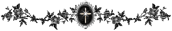
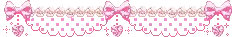
black lace border

brown lace border
you can pretty much use any image as a border- as long as you understand the dimensions and how to center it. experiment with the code, it's fun!cred for the borders provided: baeyhkun

white lace border
pink lace border